The challenge with user behavior analysis
Even with Product Analytics platforms at our disposal, deep insights can still be frustratingly elusive
I'm noticing a pattern as I network with others in the Product Analytics space. We inevitably touch on approaches to understanding, and taking action on, user's in-product behavior. This might have to do with my background in UX (they might think it's a topic that I enjoy... and they're correct!), but I also think it's a testament to the current state of affairs with standard approaches to user behavior understanding in Product Analytics platforms.
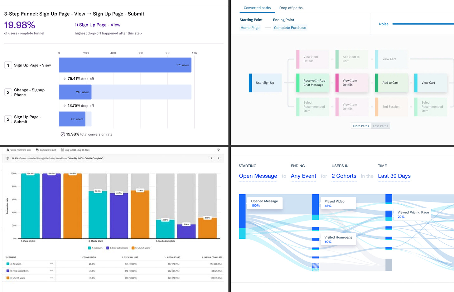
Features to understand user behavior are increasingly must-haves for these platforms, and most of them visualize event data with funnels, task flow diagrams, Sankey diagrams, and/or other tools to take the flood of different events in each user's session, and distill all that information visually.

Visualizations like these feel like they should scratch our itch for understanding user behavior, right? It boils down to the data to a handful of the most common paths that we can expand, or filter, at will. So why is it so hard to reliably find deep insight, and take action, from these views?
We're asking the wrong question.
When stakeholders come to my team with a question about user behaviors, it's usually something like, "Which user paths are the most common in our product?"1 Or the more vague, "Can you just find some insights from how our product is being used?"
The value from understanding user behavior comes in identifying paths that are inefficient, confusing, and frustrating. From a metrics point of view, these are the paths that lead to abandonment / churn, cycles or unnecessarily long paths for simple tasks, and dissatisfaction. These likely won't be the most common paths in your product, but they are the most insightful. So we need another approach to finding these paths other than merely stack ranking by frequency.2
I'm on a mission to improve corporate data culture for data professionals of all stripes, in Data Science, UX Research, Analytics, and beyond. If you’d like to join me, you can help by sharing this newsletter with the data culture drivers in your network.
We're missing important events.
As products grow, the teams supporting them do as well. They split into sub-teams focused on particular parts of the product, and inevitably, seams start to show up in the product. Tasks that take users across those seams are often the ones with the most rough edges.
Just as the UI has rough edges at those seams, so too does event tracking. Most efforts to keep event tracking current follow the lead of new product development, focusing more on the new features and less on how they fit into the bigger picture of the product. Once we understand the tasks of interest, we need a way to ensure that all key steps in that task are represented.
Common visualizations obscure important patterns.
When you consider common task flow and Sankey diagrams utilized by most Product Analytics platforms, there's really only a few takeaways you can glean from them: Which events come after which others; which flows are longer than others; etc.
The biggest wins my teams have seen from user behavior analysis have come from insights that weren't immediately visible in these diagrams. When are users starting over on a task? When are users caught in a loop, and is that a good thing (meaningful engagement), or a bad thing (utter confusion)?
When my teams were regularly answering questions like these, it wasn't with the help of a Product Analytics platform. Each time, it was because an inspired Data Scientist played with a custom visualization to help the core question pop. And once it did, suddenly the stakeholders' itch was scratched: There was clarity on where in the product users were having difficulty at scale, and action could be taken to improve it.
In summary, I see three challenges that keep us from getting the most out of user behavior analytics:
The most insightful user paths aren’t the most common, so we need another way to identify that signal amidst all the noise.
The most meaningful events aren’t tracked, because they sit on the seams between features or product teams.
The most common visualizations aren’t designed to let the key insights pop, making them harder to discover.
Next week, I'll share how I've steered my teams to address these challenges (find that post here!). In the meantime, I'd be curious to hear others' experiences with user behavior analysis — either using a Product Analytics platform, or building something from scratch. What are your common struggles? What's your biggest success story? Leave a comment and share your thoughts!
For most products, the top N common paths will consist of users who show up and immediately leave, and users who complete common tasks in expected ways. Neither of these are particularly insightful. This should be the first indication that we probably have the wrong question.
When a Data Scientist hears a request to understand which paths are most common, they may reach for Markov models. I get it, and there can be a lot to uncover with that approach! But while they definitely have a place in understanding user behavior, I think it's prudent to start with discussion and targeted exploration to lock down the problem you're trying to solve first.

